


 Register
 Wishlist
 Contact Us

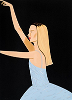
Artists between genres and even from different sectors collaborate to get the best use of talents in the art industry around the world. from Italian to Korean, Japanese to American…
Many artists have been working with musicians in order to create an appealing but most importantly unique album cover, for some time now. It is not always so easy to distinguish these interdisciplinary artworks. So, we have brought you some of our most favourite album covers from a variety of genres. Let’s dive into the world where music and visual arts meet and create beautiful depictions of the emotions that music conveys.
ALBUM COVERS FROM ARTISTS: OUR FAVOURITES
Here are 6 famous artists who have created amazing artworks for musicians we listen to every day!
- David LaChapelle x Travis Scott: Astroworld
- Jeff Koons x Lady Gaga: Artpop
- Miaz Brothers x Achille Lauro: Superstar
- Andy Warhol x The Velvet Underground: Banana
- Mr. Brainwash x Madonna: Celebration
- Marco Lodola x 883: Gli Anni
DAVID LACHAPELLE x TRAVIS SCOTT: ASTROWORLD

Famous pop-photographer, David LaChapelle, took one of the best album covers for Travis Scott. LaChapelle’s photo for the album Astroworld in 2018 is a depiction of the Astroworld, a shut-down amusement park in Houston USA.
David LaChapelle has been working with celebrities, creating album covers, music videos, campaigns and more for a long time. In this project, he designed and photographed this shut amusement park with a big, golden inflatable portrait of Travis Scott with 2 versions as well as a series of album release photos.
One of the settings is at night and the other is during the day.
In the first one there are kids and some parents enjoying their time at the carnival, jumping excitedly with a bucket of popcorn which is captured in the action, creating a beautiful and dynamic atmosphere.
The other one is at night and with a lot of female models all around the inflatable Travis head. There is a lot more chaos and excitement around compared to the other one. If you have not realized, on the left-bottom-corner, there is a action-figure of Travis Scott!
The second version has a bit of controversy and was all around the news for a while. David LaChapelle and Travis Scott were working with the trans model Amanda Lepore, who was removed from the picture.
David LaChapelle, as well as Travis, was being accused of taking a trans model off the project due to transphobia. However, the two later explained that the decision had nothing to do with any kind of hate, and it was simply because Amanda’s pose and persona would upstage everyone. Travis wanted clear the controversy by explaining the decision on his Instagram account by posting this;
Thank you David LaChapelle and Amanda Lepore and everyone that came out to make all the covers and the vision come to life!!! ASTROWORLD IS ABOUT LOVE AND EXPRESSION NOT HATE! This is very important for me to speak up about: Growing up I've been taught to accept everyone, not to cast people away but bring them in your home! I have nothing but respect for the LGBTQ community. I want to use my voice to make it clear that everyone on this planet is as equal and fucking awesome to the next. Me and LaChappelle set out too create images that i grew up watching him create for years that inspire me today. Yo Amanda you did upstage everyone even me and i can't wait for everyone to see the booklet that me and Dave put together that includes all these images. thank you for being apart of it. Sorry for the misunderstanding Love you guys and THANK YOU ALL!!! EVERY ONE IS WELCOME TO ASTROWORLD!
JEFF KOONS x LADY GAGA: ARTPOP
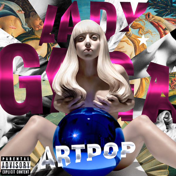
Jeff Koons created Lady Gaga’s album cover for the album ARTPOP in 2013 by taking a picture of her, naked, sitting in front of a big blue gazing ball with her legs open and her hands covering her breasts. The background of the work is triangular cuts from Botticelli’s Birth of Venus and Gian Lorenzo Bernini’s Apollo and Daphne.
One of the biggest blue-chip artists in the modern world, Jeff Koons, and Lady Gaga’s work together for the album cover resulted in becoming a source of muse for other collaborations and projects from these artists with various styles.
Jeff Koons’ gazing ball artworks are widely known for their place in the contemporary art world, creating a bridge between classical and contemporary art. Jeff Koons makes it possible for the viewer to reflect their state in comparison to ancient times. Most of the time, these are paintings from the master painters from the classical eras, however, it is possible to find Jeff Koons’ sculptures with a ball placed somewhere around the figure.
Jeff Koons, in an interview, mentioned his first time meeting Lady Gaga was during the Metropolitan Museum of Art Annual Ball. She had just done a performance and the two artists met for the first time to discover they both have a huge interest in each other’s work. After this, it was just a matter of time for these artists to work together.
The artwork by Koons depicts Gaga in front of a collage of some (other) famous figures, Apollo and Venus. Jeff Koons added these paintings by Gian Lorenzo Bernini, and Botticelli to give a message. This plays with the idea of Gaga as Venus and Apollo with symbolism as; Apollo is the god of music and Venus is the goddess of nature, fertility and beauty.
MIAZ BROTHERS x ACHILLE LAURO: SUPERSTAR

The album cover by Miaz Brothers, Lauro - Achille Idol Superstar is a blurry and grayscale portrait painting of the singer with red eye make-up. The large and punk text on top of the portrait reads “Superstar”, the title.
Achille Lauro, or Lauro De Marinis is an Italian Hip-hop artist. He is a rapper, singer, and a songwriter.
His album Lauro - Achille Idol Superstar was published on April 15, 2021. So, it is a relatively newer album.
Roberto and Renato Miaz are brothers that do amazing artworks together. Their thing is to create a blurry image as if you are looking at the beloved paintings that got into pop culture, like the Mona Lisa, through a frosted glass effect.
ANDY WARHOL x VELVET UNDERGROUND: BANANA

Andy Warhol is known to be one of the most famous interdisciplinary artists who have done all sorts of artworks ranging from movies to his popular prints. However, did you know that Warhol was one of the producers of the album?
This album cover, by Andy Warhol, The Velvet Underground and Nico is special since it is super popular not only among the listeners of the group but for everyone.
Made in 1967, Warhol is the person who has managed to find people, places, and resources for it to become glamorous. Even though he left total creative freedom to the band in terms of musical aspects of the project, he managed the visual part by himself.
The album cover became so popular that people would start calling the album as “the banana album” rather than saying its whole name. The art of the album cover is unique compared to the overall norm of how an album cover should look like, especially in 1967.
The album cover did not fit the general templates of how an album should look like. There is nothing to see other than a blank white background with no title or artist or anything. It contained just a vibrant yellow banana with Andy Warhol’s name at the bottom. The back of the album had information the artist didn’t want around his cover design.
Moreover, the early editions of the album cover had a peelable sticker, with a text that reads “Peel Slowly and See”. Once you peel the black-yellow sticker of the banana peel, you would find the pink banana underneath. No surprise it became a special item in many collectors’ dreams.
As well as Warhol having created the album cover, he also worked with them in his multimedia project Exploding Plastic Inevitable (EPI). The Velvet Underground and Nico played live during Warhol’s shows between 1966 and 1967. The following year, in 1968, Andy Warhol and The Velvet Underground cut their ties.
MR. BRAINWASH x MADONNA: CELEBRATION

Madonna has been in the street-art and graffiti world since before her fame, whether it is related to her intimate relationship with Basquiat or not. Therefore, it is no surprise that she wanted one of her greatest hits compilation, Celebration, album cover to be created by the talented Mr. Brainwash.
In 2009, Mr. Brainwash created DVD covers and more in addition to the album cover for world renowned Madonna. The artwork was made thanks to the french photographer Jean-Baptiste Mondino in 1990.
The artwork is a silkscreen print of a photo, which then was hand-painted in yellow, blue, and red. The primary colors on a warm background are vibrant. The superstar’s expressive, piercing gaze with the saturated blue that stands-out from the light orange background compliments each other.
The background seems to be an old newspaper which had gone through a lot. It is cracked, ripped and fixed. The overall image is a reminder of the grainy pop-art style Marilyn Monroe portrait.
MARCO LODOLA x 883: GLI ANNI

883 is an Italian pop band originated from Pavia, Italy in 1991 and it was active until around 2003.
The name of the band comes from their members’ common interest in motorbikes but specifically Harley Davidsons. 883 comes from the 883cc Harley Davidson Sportster, a beautiful bike series from 1957.
After sending some demos out to Claudio Cecchetto, an Italian DJ and a producer, they started to make songs and even hit the first place with their song “Hanno Ucciso l’Uomo Ragno” (“They Killed Spider-Man”) in Italy.
The album “Gli Anni” was published as their greatest hits collection in 1998, with the album cover created by another talented Italian artist, Marco Lodola.
Marco Lodola is known for his faceless figures with vibrant paints and lamps that reflect the Italian and Pop cultures in an illuminating way!